Tuesday 6 December 2016

Layers painting - 13/11/16


For the final life drawing session with the module, I wanted to direct my attention towards working with acrylic paints. I had not yet worked using this style throughout the previous coloured workshop so it would be the ideal time too plus the finally of the garage sessions, so I seemed rather fitting to explore a more stimulating method. I was confident with how I’d previously managed using colour tone towards the body whilst crating with watercolour and oil pastels.

I felt I needed this push to provide progression through each class.

The first exercises, we’d warm up and display a series of pencil/ pastel sketches of the module’s body. For this piece, we’d work with a time limit of 1 minute per drawing.

(2B - Pencil & Black Pastel)


Each figure overlaps one and other, however a clear display of body angels in a variety of postures done with pressurizing timing.


For the main task we’d provide two colours, each colour would be used separately, this way we could concentrate our efforts on a single aspect of the painting for 10 minutes each. Also with added bonus of  white for the light & blending aspect. It was also worth providing a background coat for the portrait which are tutor made something to contemplate.


 1).The beginning of the study I felt could've been more effective. I wasn't too pleased with first entry into my acrylic gallery, I felt the image didn't stand out with these in particular tonal coats. A key feature that wasn't displaying a vital role was the background to contrast substance, instead only small patches of the shadow from the legs chairs and feet.  

2).I was extremely satisfied with my second painting, I found working the yellow and blue a perfect contrasting colour scheme as both works effectively against the white tone. Taking notes from my last painting I made sure to use a background making the portrait feel as if it exists in an environment, even if I doesn't show objects it defiantly improved this painting.  

3). Is where I enhanced my approach, finding the painting element controlled. My behaviour of working with acrylic felt improved as I wasn't being bogged down in certain aspects, which would result in parts of the body missing and not worked upon. Once again finding much impact to the surrounding colour, however when looking back I do wish I'd had more time to make the background a larger coat of paint.  


4). My final entry for the layers piece concluded with using Red and Naples Yellow which as a result displayed a very peculiar contrast, the mix revealed a metallic texture when exposing the page to a light.  when reviewing each others progress after 30 minutes had stopped. I feel very disappointed as I didn't work with a background, but most obviously a chair, so I left the image on a empty page.

At the end of the workshop, we focused are attention towards each other progress and how they tackled the process, which was very interesting, having an understanding of how we approach a assignment. I had previously talked about how the image shows a metallic appearance, this was brought up by my one of the class colleagues. I find it supporting to examine everyone's progress as it build confidents and to learn how others respond to your work.


Monday 5 December 2016

Cafe Portraits - Visual Diary 7/11/16


“Practicing your speed drawing is an important skill that will allow to capture the essence of a person in minutes and/or seconds. By drawing people out and about as you see them will force you to draw them FAST purely out of necessity”

This task was unique as it meant we had to target a series of complete strangers to take part in are coursework, but it was without their permission, originally this was focused heavily on a zoo trip however I wasn’t able to join this workshop so I had to find the alternative, so it was very strange just picking some poor sole minding his or her business to have me drawing the action, pose and characteristics.

However, it was very interesting as it gave an insight to how everyone has unique personality, I still have a clear visual memory of some of the people I studied for the homework whilst out in town.     
 McDonald's Restaurant 15:45


The noticeable feature throughout these pieces was the their heads were facing away from me.

I made sure to provide detail towards how quick or how long I worked through each piece, staying no longer than 8 minute on each person.

I revisited this task again and decided to work outside a restaurants table outside for a more easier time not having to work with peoples backs turned.

                       Costa High-Street 16:00


Tones. Wet & Dry Media 7/11/16


For some artists, there exists a clear distinction between drawing and painting. The former is a dry process, involving pencil, pen or charcoal, and the other involves wet paint and brushes.

But there are no rules. Whatever media you have is media you can use in a painting, though some get along better than others. Pastel lines over a watercolour can help to emphasize lines and shapes. A bit of acrylic paint in a charcoal or pencil drawing can add a shock of colour to an otherwise black and white composition.

Here was where we’d expand upon are knowledge and begin using a verity of medias’ involving colour, however before we’d enter this task we were asked to complete a series of black and white sketches, from my personal understand it was to get the class geared up towards the main achievement later, as well as showing form and what the response will be towards working through colour.

The following task required us to squint through our eyelashes. This would reduce the mid-tones, leaving only the darks and lights. The proportion aspect was taken into account, pastel was the theme during the start of the workshop, which I'm more confident using than a pencil, because I find black pastel for my work more impactful.


Here we'd reverse the assignment displayed the previous session and had to provide the black on a pure white sheet. Working whilst having are eyes reduced to focusing on the form and light tones was comforting as it gave us time to prepare are selves later on.


I wasn't pleased with the end result for this pose as I had to work head on with the face as well as foreshortening the figure whilst squinting the image, I was in conflict with myself and resorted to having detail throughout the upper body, but my major problem was the proportion as it was very poorly scaled with the shoulders and the legs.


The technique now was requiring 2 colours - we made sure the two colours
contrasted, example: red and blue. Here we began are decent into colour.


Once again using the ongoing rule of squinting the eyes.
Very curios with what the result provided, the inclusion of colour was a fresh take and I felt a scenes of progression undertaking when colouring at this point. It's obvious to know which colours display which tone.  


Water colour (Left) was also an aspect I explored during the session to, once again focusing on using a was or light red, whilst displaying a background layer which brought substance towards the paint outline. The proportion was used very carefully especially working with equipment which wouldn't erase out, so pressure was there.  


Now I drew my attention for a more messy approach which is were Oil Pastels made an appearance towards the end of the workshop. I found the modules pose strikingly different from anything we'd worked with. My choice of colours was keeping with contrast so shadows and lighter tones are clear, also displaying more substance to the object as it played a vital role for the piece.  


Subtractive Tone - Self Portrait 24/10/16


This week’s homework tasked me to complete a series of portraits only with a strong light from a lamp against myself to capture shadows and forms of light.

I have focused my attention towards the face itself were I cut an A3 page to fit both self portraits. The result was a success as I felt I obtained a clean understanding of the workshop lesson and wanted strong white & black giving a move impactful image, I decided to have my hair down to see what I could attain from the fringe and see if a noticeable shadow is shown beneath the hair.  
15 Minutes was used towards both portraits.


Both photo display the shadow on both sides of the face, which I felt provides a subtle but difference towards the each pose, especially through the angle I choose. However I do believe I'd continued towards working on a full body piece. 

Subtractive Tone 24/10/16


First we'd cover the whole of the drawing paper with charcoal, edge to edge, in a mid-to dark tone, by using the side of the charcoal stick, and a tissue or old cotton rag to slightly rub the charcoal into the surface of the paper.
Then we’d would remove areas of the charcoal with a rubber to expose the figures outline and light throughout. The module would pose whilst having a light focusing on her, to make the light strong and easier for us to find aspects of the body to work with.


This would be my favourite session, as I found this method both simple but effective towards the final result. It didn’t subject me towards working clean and tidy, but instead experimental, seeing as the paper had already been covered in charcoal to begin with. Something that provided support was looking at the image with less focus, to avoid looking at detail but instead to inspect heavily on the form of light.  
Unfortunately I wasn't able to complete these pieces
, however I really am not irritated as I feel that the legs give a good insight into the progress used towards the task required from us.

What I found very satisfying was seeing how I captured the form of light towards certain area of the figure shoulders were effective being careful not becoming distracted and exposing to much out.  


The style itself gives an eerie approach giving the image an authentic behaviour with the strong black background and very harsh use of removing aspects for the white surrounding the face and chest. With an untapped section of the upper back leg with solid black.   


Holding Different Objects 17/10/16


In this exercise, you will make a variety drawings and/or paintings of your hand holding different objects.

Whilst working on this piece I developed two pieces which was in the same media ‘Oil Pastel’ I made the decision to alter the colour of the game controller to avoid both images being plain and very impactful upon first viewing however, I could have improved significantly more with the oil pastels. For my final piece with the hair dryer I focused on a limited time of just 10 minutes with the style standard with ink stains, which I thought would be effective for the darker tones.


I feel the inclusion of using both drawings with oil pastels was because I feel that this media makes me work the quickest because of its messy tonal display, especially how I work with them.

Now I should explore new medias for when working on limited time. That is what I’ve have taken away from this homework making me more aware of what to investigate for quick/ rough drawings.     

Forshortening 17/10/16


Life and Observational: Foreshortening


Foreshortening is when an object appears to be receding into the distance or coming straight out at you.


Here are skills we required from the previous session would be enhanced. Here we would draw the module now laying down in a series of different poses, masking parts of the body looking as if it’s withdrawing.


My response towards receding the figure was naturel, I felt confident with my scaling approach as I continued with framing the image through my fingers to determine how the image would fit. I made sure not to become too in-depth with detail something we were tasked to avoid.    


B Pencil/ Black Pastel

I did have issues with working with horizontal lines which are shown within the module, to determine the measurements I choose to display a series of lines coming out of the subjects limps of where the angles pointed.   


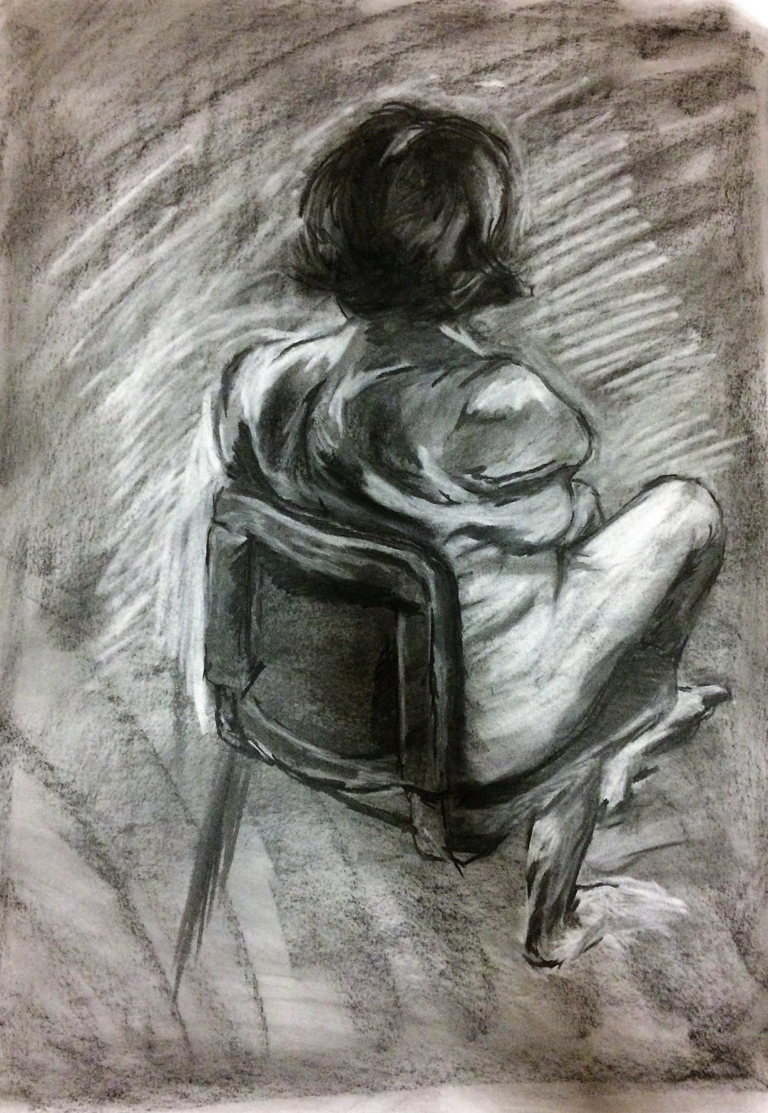
The remaining time we had within the session we were allowed to go in-depth with the detail. Both pieces had a time limit of 30 minutes each. I had put a lot of focus towards the negative spaces, the most noticeable aspect was the shading captured around and between the legs and arms.

Still Life 'Self Portrait" 10/10/16


To practice further some of the continuous line drawing and shading skills we looked at in last weeks class.

The purpose of this homework was providing lavage towards future sessions, the aim was to focus using different techniques to enhance are knowledge and skills.

I started by doing a series of singular object drawings to practice before doing the main homework required. I wasn’t confident with my approach towards continuous line & pastel tone work so that’s where I decided to aim improvement on.
 Fine-Liner 3.0 was used for the continuous line drawings.
As well as understanding my skills I wanted to see what would work towards my main piece. I was concerned with the amount of objects required for the homework so here I experimented.


Headphones were a notable inclusion throughout the work, however I concluded with avoiding them because I wasn't satisfied with the final results in each practise sketch
.


I had to provide three different drawing describing myself through objects that relate to me, this meant I could be experimental with displaying the work as well as what would be displayed: A controller, Converse shoe, Coffee mug & A graphic novel.


 The final conclusion of the homework I was extremely pleased with the end results throughout each piece displaying a series of strong line work and I feel I displayed a good balance with detail and work on a limited time. Something which made the work effective was how I placed each object, not masking and hiding too much. The one mistake I feel was necessary was removing the text on the graphic novel, which was used for continues line, but was removed with the remaining pieces, however I didn't want to take too much time being bogged down with the detail. But does take away the viewers knowledge of a book, if reviewing the pastel piece separate.

The Proportion 10/10/16

This session we explored proportion with life drawing. This meant drawing the figure with such focus measuring the module in the space, we were shown methods to use preparing this type of piece. This included framing the image with are hands as well as scaling with a pencil. I found this experience to be a challenging because we had to be very precise with scale, constantly double checking proportions against parts of the body. Above is one of the session's pieces, here I've used the technique of measurements from the modules head as a template to scale the rest of the figure. Notice the horizontal lines within the drawing. This was provided on the module blog to give insight into the workshop, I found this to be extremely resourceful with guidance to displaying a measured portrait.

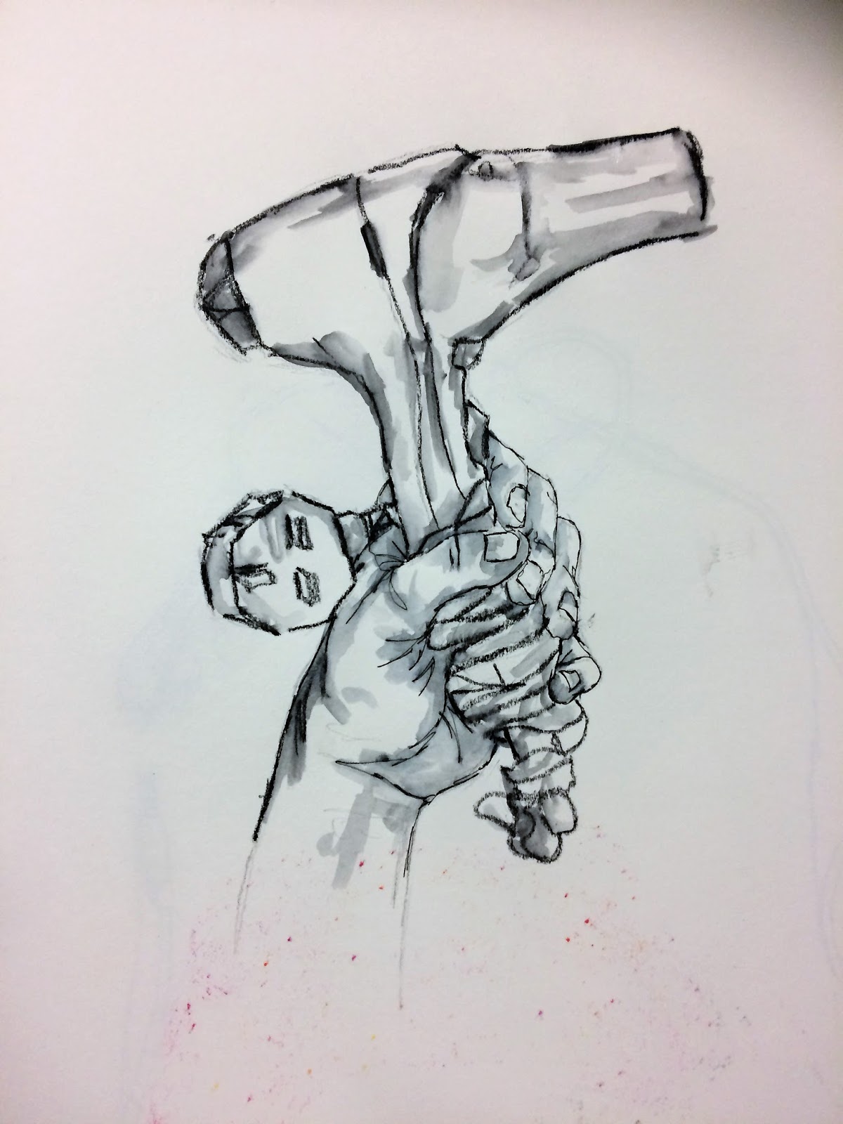
Originally this piece was completed using a standard pencil, however I decided to revisit with much noticeable line work using a pastel stick.
Here was the first drawing of the workshop that lesson, the most noticeable feature is the amount of detail I included with in the piece, whilst the other drawings I scaled back with the content. Here I wanted to give insight into how the tutor wanted us to work.